How to Salvage an Underexposed Photograph: Three Versions of Madrid’s Palacio de Cibeles
A photograph does not always come out of the camera the way we remember seeing the scene. Sometimes the exposure is wrong, the shadows are too deep, or the bright sky overwhelms everything below it. Yet an imperfect exposure does not necessarily mean a lost photograph. With a little patience, some selective adjustments, and occasionally a change of artistic direction, an ordinary travel photograph can become something considerably more interesting.
Our example comes from Madrid, Spain, where the magnificent Palacio de Cibeles rises behind the famous Cibeles Fountain. The building’s elaborate white façade, tall clock tower, decorative sculptures, Spanish flags and busy roundabout make it an irresistible photographic subject. Unfortunately, they also create a difficult exposure problem. Bright clouds and pale stone compete with darker architectural recesses, trees, vehicles and the fountain itself. A camera has to accommodate a considerable brightness range, and the resulting JPEG may look flatter or less balanced than the scene appeared to the photographer.
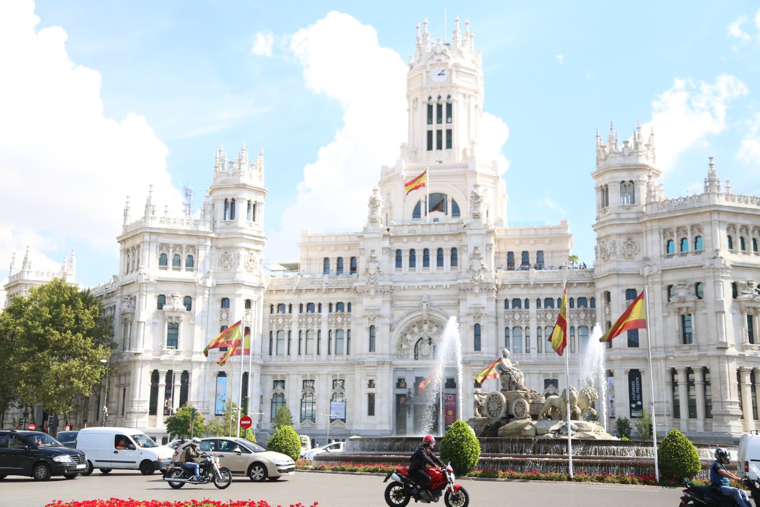
The original photograph illustrates the problem rather well. The midday light is harsh, the clouds are extremely bright, and some parts of the white building approach the limits of highlight detail. Meanwhile, the street-level elements and recessed architectural details appear comparatively dark. Strictly speaking, this is not a uniformly underexposed photograph. It is a high-contrast scene with an uneven tonal distribution, and that distinction matters when deciding how to correct it.
The first temptation might be to increase exposure across the entire image. That would brighten the darker areas, certainly, but it would also make the already bright façade and clouds even brighter. Some highlight information may already be irretrievably lost. The better approach is to work selectively, balancing shadows, highlights and midtones rather than simply moving the exposure slider to the right.
A useful starting point is to reduce highlights, lift shadows moderately, establish a convincing black point and adjust the tone curve. The goal is not to make every part of the photograph equally bright. Quite the opposite: preserving a believable relationship between light and shadow is what gives an architectural photograph its depth.
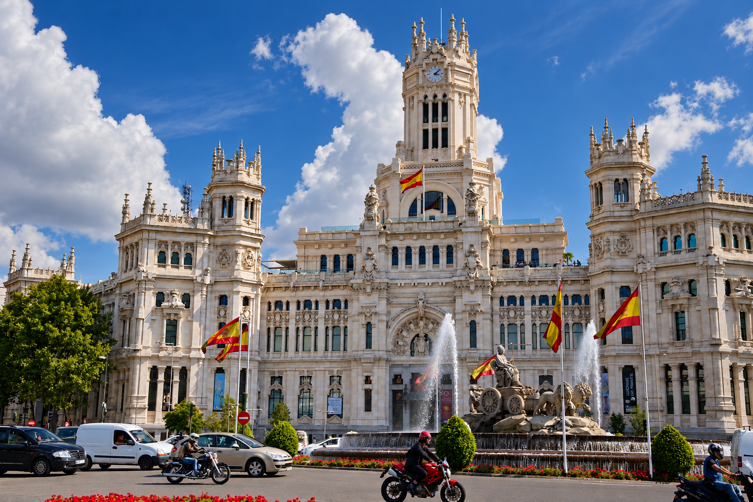
The second version takes a different approach. Rather than attempting to eliminate every dark area, it embraces a stronger tonal structure. The sky becomes a deeper blue, the white architecture acquires greater separation from its surroundings, and the shadows give the composition more visual weight. The Spanish flags, greenery and fountain become more noticeable against the stronger contrast.
There is a trade-off, of course. A darker sky can easily become unnaturally saturated, and excessive contrast can obscure fine details in the façade. The objective should be to direct attention toward the building without making the editing itself the main attraction.
For this type of color correction, local masks are particularly useful. The sky can be darkened independently of the building, while shadows beneath the arches and around the fountain can be opened slightly. A restrained adjustment to clarity or texture can bring out carved stonework, but too much sharpening creates harsh edges and artificial-looking architectural details.
It is also worth remembering that the original file format matters. A RAW file generally offers substantially more latitude for recovering highlights and shadows than a processed JPEG. When photographing white architecture against a bright sky, protecting highlights at capture time is often preferable to attempting a dramatic rescue afterward.
But sometimes the most interesting solution is not to restore the original color photograph at all.
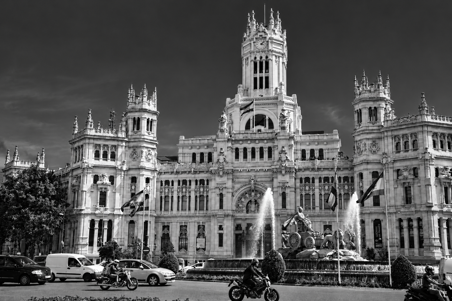
The third version abandons color in favor of a dark, high-contrast black-and-white interpretation. Suddenly, the photograph is less about a sunny afternoon in Madrid and more about architecture, geometry, light and movement. The central clock tower becomes a commanding vertical element, the sculptural fountain stands out against the darker surroundings, and the passing motorcycles introduce a small but welcome sense of everyday urban life.
Black-and-white conversion is especially effective when the original colors are distracting or when the scene contains strong shapes and tonal relationships. Removing color allows the eye to concentrate on the rhythm of windows, the elaborate stone carvings and the contrast between the monumental building and the relatively tiny vehicles passing in front of it.
One important lesson from this experiment concerns the sky. A dramatic black sky may initially look impressive, but it can also dominate the photograph. The more successful approach is to keep the sky subdued enough to support the architecture rather than compete with it. Darkening the sky, reducing distracting cloud detail and maintaining luminous stonework can produce a more balanced composition.
For photographers working in Lightroom, Camera Raw, Capture One or similar software, the practical workflow is straightforward. Begin with the original file and correct the overall exposure only as much as necessary. Recover highlights where information remains, raise shadows selectively, establish the black and white points, and refine the contrast with a gentle tone curve. Then use local masks to treat the sky and architecture separately. Once a balanced color version is available, create a virtual copy for a more dramatic interpretation and another for black-and-white conversion.
The three Madrid images also demonstrate something beyond conventional exposure correction. The revised versions are creative reinterpretations, not merely technically adjusted copies. Image-generation techniques can reconstruct or alter details, so they should not be confused with a strictly faithful photographic restoration. If documentary accuracy matters, conventional editing of the original pixels is the appropriate method.
That distinction does not diminish the creative possibilities. Photography has always involved interpretation, from choosing the exposure and film stock to darkroom burning and dodging. Modern digital tools extend those choices considerably, although they also make it easier to cross the boundary between correction and reconstruction.
Looking at these three versions of Palacio de Cibeles, I would not automatically choose the brightest or most technically neutral photograph. The original preserves the character of the scene as captured. The darker color version offers a more forceful architectural presentation. The black-and-white version transforms the same subject into something closer to a dramatic urban study.
And perhaps that is the most useful lesson. A disappointing exposure need not be the end of a photograph. Sometimes the answer is careful technical correction. Sometimes it is a stronger creative interpretation. And sometimes, rather unexpectedly, removing the color is what finally allows the subject to speak.
Photographs: Palacio de Cibeles, Madrid, Spain. Original photograph and two creative revisions. Images hosted by Pxef.com.