The Right Hero Image for a Brand Site
Most brand about pages make the same mistake: they choose a hero image that announces effort rather than attitude. A polished studio shot, perfectly lit, perfectly composed, and perfectly empty of anything a viewer would want to linger on. The image signals production value. It communicates nothing.
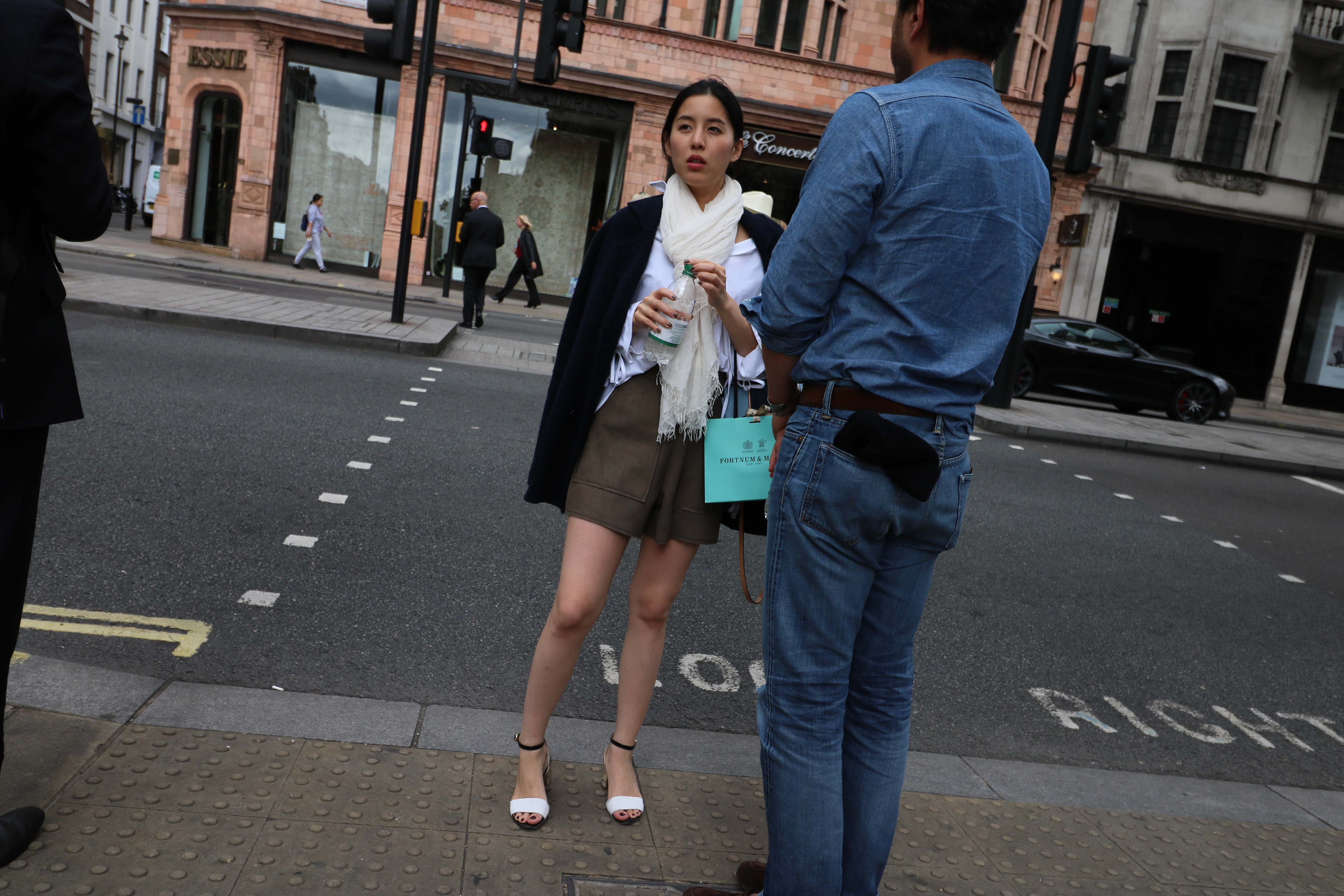
The shot used on the BrandsToShop.com about page takes a different approach. It is candid London street photography — a woman mid-conversation at a West End crossing, Fortnum & Mason bag in hand, white ankle-strap heels on tactile-paving, the red stop signal just catching the background frame. She is not performing for the camera. That is precisely the point.
What makes an image work as a hero is not resolution or lighting ratio. It is the presence of a real moment — something that could not have been directed, only caught. The shot has tension because she is between things: between steps, between words, between the street and the pavement. The eye reads this as energy rather than pose, and energy is what a shopping-oriented brand site needs its first image to project.
The compositional logic is worth examining. The man in the denim shirt occupies the right third of the frame and faces away, which gives the viewer a surrogate position: witness to the scene rather than subject of it. His presence grounds the image in social reality without competing for attention. The woman becomes the natural anchor because she is the only face visible, and faces always win. The Fortnum & Mason teal is the single colour accent in an otherwise muted palette of navy, khaki, cream and grey London concrete — a deliberate-looking detail that was simply there.
For web use, the image crops cleanly across a wide horizontal banner format. The road occupying the lower third can be trimmed without losing the figures, and the relatively neutral sky and building tones in the upper register give a text overlay room to breathe. A site title or tagline placed in the upper left clears the subject entirely.
The lesson is not that brand photography should always be candid. It is that the hero image on an about page is doing a specific job: it is the first editorial statement about what the brand thinks is worth looking at. A street photograph from the right postcode, with the right eye behind it, says far more about taste than any planned lifestyle shoot. Taste, for a brand aggregator, is the only real argument.