Him, Her: A Photograph That Works Like a Renaissance Diptych
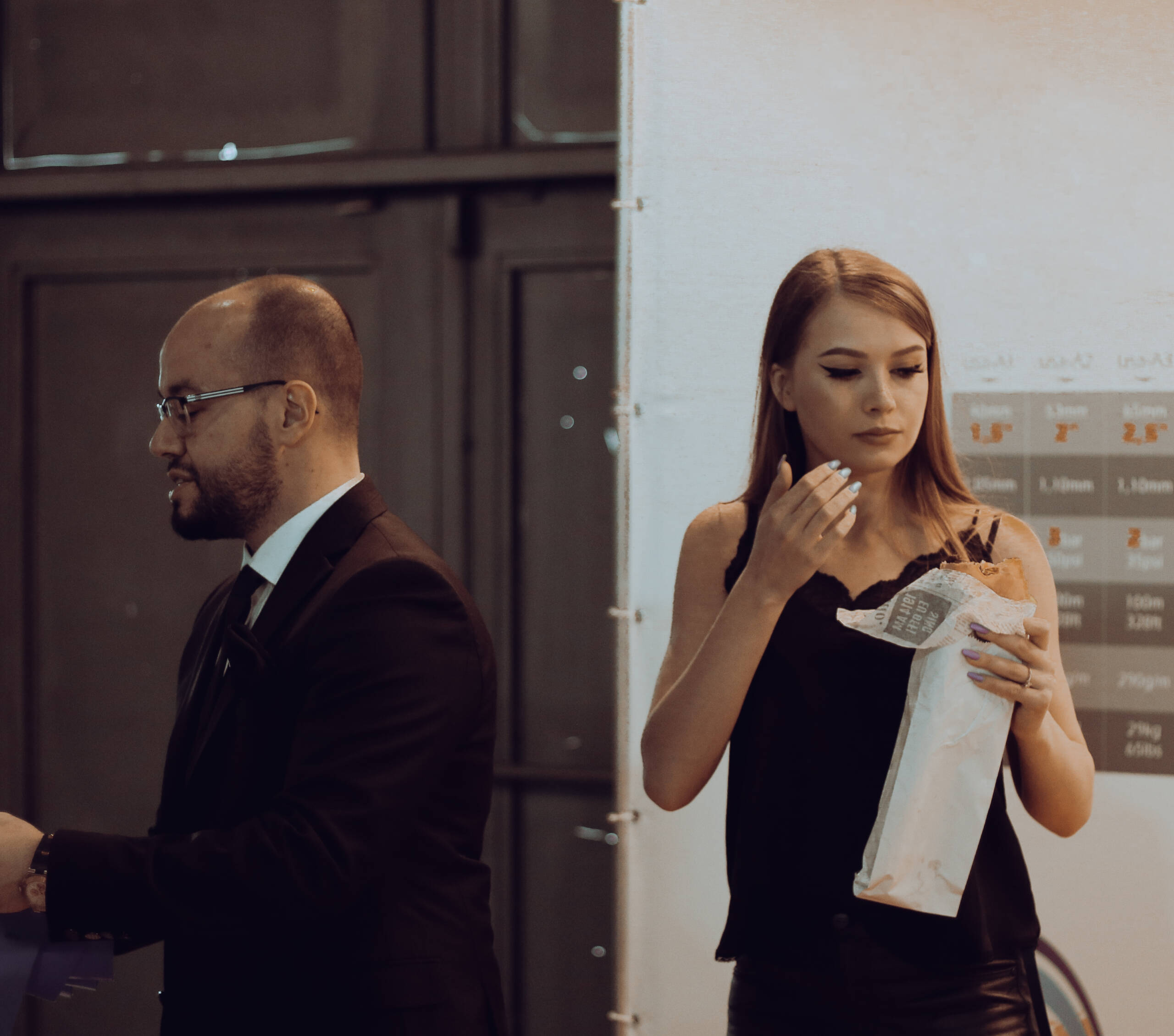
Two figures share a photograph and refuse to share anything else. He stands on the left in a black suit, glasses, mid-sentence, addressing someone outside the frame. She stands on the right in a black slip dress, eating from a paper wrapper, eyes down. Running between them is the white vertical edge of a display panel, and that edge does more work than either sitter.
The object
The panel edge falls near the golden section rather than the middle, which is why the split reads as deliberate instead of careless. It is also the brightest thing in the picture, so the eye lands on the division before it lands on either face. Everything else is arranged around that line. He occupies his half in profile, filling it. She occupies hers frontally, with air above her head and the background pushed back.
The tonal treatment does the stitching. Warm monochrome collapses skin, black cloth, brown lockers and white panel into one family, and without it the two halves would separate into two unrelated pictures. Colour would have broken the frame in half for real.
Behind her sits a specification chart, orange and grey, millimetres and weights and thicknesses. It occupies exactly the position a gold ground or a landscape window would occupy in the painted version and performs the same job, telling you which world these people belong to. His half gets no such ground, only dark metal cabinets. One sitter is placed in a context, the other is placed in shadow.
Then the attributes. Painted sitters came with a book, a rosary, a coat of arms, a hound, and the object told you what kind of person you were looking at before you read the face. Here he gets the suit, the tie, the glasses, a watch at the wrist, a hand extended toward business happening off-frame. She gets a crumpled paper wrapper, painted nails, one hand raised to her mouth. Formal attribute against everyday attribute, assigned cleanly, with no editorial about which is worth more.
The lineage
Devotional painting spent three centuries on this exact problem. A diptych gave you two panels and one hinge. The donor knelt on one wing, the Virgin sat on the other, and the two never shared a painted room. What bound them was carpentry. The frame asserted a relationship the picture space denied, and viewers accepted the claim without argument.
Piero della Francesca pushed it further in the Urbino portraits. Federico and Battista face each other across a physical gap, profiles locked, landscape continuous behind them. The gap is the subject. Close it and you have two ordinary portraits.
Turning the sitters away from each other is a later move. Degas put couples in one interior with no sightline between them. Hopper built a career on two people in one room and two separate weathers. At that point the device stopped meaning marriage and started meaning proximity without contact, which is the register this photograph lands in.
The part that could not be arranged
The panel is real architecture. It was standing there holding a spec chart at a trade fair, and it happens to divide the frame at the proportion a painter would have chosen on purpose. That much is luck plus the decision to stand in one particular spot.
The rare element is the timing. Both gestures resolve in the same instant. His hand is out and his mouth is open, so he reads as speaking, which requires a listener the picture withholds. Her hand is up at her mouth, eyes down, which reads as private, which requires no one at all. One figure is addressing the world and the other has withdrawn from it, and the two states are legible at a glance without a single facial expression doing the explaining.
Stage this and it dies. A directed model raising a hand to her mouth looks like a model raising a hand to her mouth. A hired man in a suit gesturing at nothing looks hired. The picture depends on both people being genuinely occupied with something other than the camera, and on neither of them knowing the other is in the frame. That combination cannot be rehearsed, only waited for.
In the jury pile
At thumbnail size it survives, which is most of the battle. The bright vertical bar and the two black masses either side make a shape a judge recognises in half a second, and the title supplies the reading without spelling it out. Titles that name the device and then decline to explain it tend to score, because they leave the jury something to do.
Where it takes damage is the toning. Heavy warm monochrome is the most preset-looking choice in amateur photography right now, and an experienced judge sees forty of them per session. The picture earns the treatment, since the tone is doing structural work, but it has to survive the first reflex of dismissal before anyone notices. A slightly cooler, less uniform grade would defend it.
Second flag: the cropped forearm entering the lower left corner. It adds nothing and pulls the eye out of the frame at the weakest point. Tighter framing at the left edge, or a small crop in post, removes the only genuinely accidental-looking element in an otherwise controlled picture.
Third, the panel edge is close to clipping. Highlight recovery there would hold the detail and keep the brightest area from reading as blown rather than lit.
Categories that fit: street, documentary, portrait when the rules allow unposed subjects. It will lose in any category rewarding technical polish and win in any category rewarding observation.
On the wall
It prints near square, so it wants a square-ish frame and a room that can take it. Sixty by fifty-six centimetres is the size where the two figures come up close to life scale at reading distance, which is where the refusal to look at each other starts to feel uncomfortable rather than merely noted. Smaller and it becomes an anecdote.
Matte cotton rag, no gloss. Warm monochrome on a gloss surface picks up a plastic sheen in the skin tones and the black clothing turns to a mirror. Matte holds the shadow separation in his suit, which is where most of the tonal information lives.
Frame in black wood, narrow profile, with a generous white mat. The mat matters more than usual here, because the picture already contains a bright vertical division and a white border reads as an extension of it. Float mounting with the paper edge showing also works and suits the documentary origin.
Hang it alone. The instinct will be to pair it with another portrait, and that instinct is wrong, since the photograph is already a pair and a second frame beside it competes with the hinge. Give it a quiet wall, centre at a hundred and forty-five centimetres, nothing within a metre either side.
In a series it belongs with other single-frame diptychs, pictures where an accident of architecture divides two people. Six to eight of those make a body of work. Fewer and it reads as one lucky frame.
Wall label: Him, Her, 2026. Archival pigment print on matte cotton rag. 60 x 56 cm. Edition of 7, plus 2 artist’s proofs.
She looks away. He keeps talking. The hinge holds.