Black and White Is the Right Call in Harsh Midday Sun When You Can't Pick the Hour
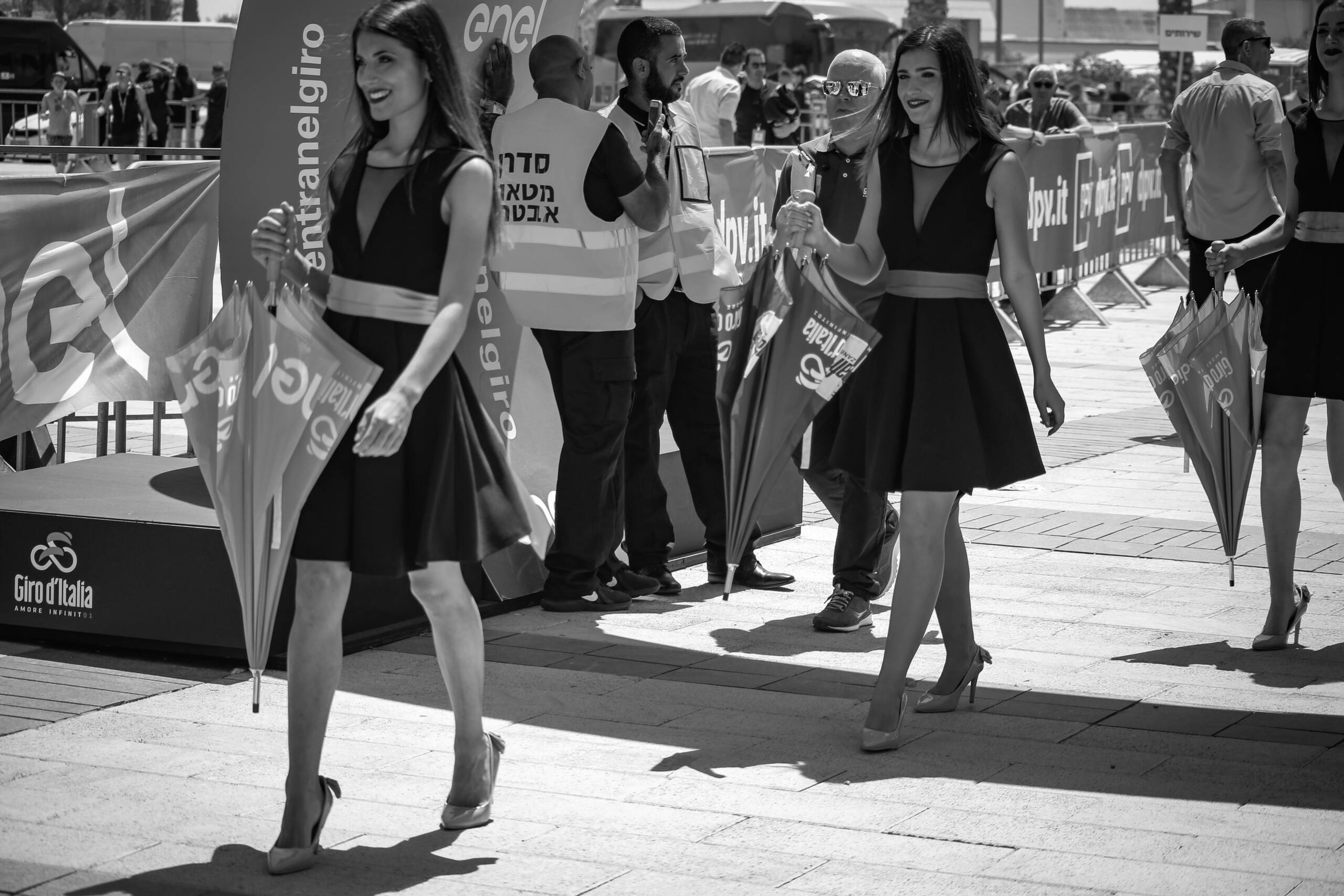
Golden hour advice assumes you control the clock. Event photography doesn’t work that way. A race start goes off at noon because the organiser sold noon to a broadcaster, and you shoot the sponsor arch, the stewards and the podium hosts in whatever light is falling at that moment. In this part of the world that means a near-vertical sun, a scene brightness range around ten stops, and shadows with edges hard enough to cut on. The fix is not diffusion or fill flash across a whole plaza. The fix is deciding, before you press the shutter, that the file is going to end up monochrome.
Colour breaks before luminance does
Dynamic range failure shows up as colour damage long before it shows up as clipped highlights. Push a sensor toward the top of its range under vertical sun and the brightest channel saturates first, which desaturates skin toward a flat orange-white and kills any gradation on a lit forehead or shoulder. Meanwhile the shadows are being filled by open blue sky, so every shaded face and every dark garment picks up a cold cast that fights the warm cast on the lit side of the same subject. You now have two colour temperatures across one face and no white balance setting that serves both.
Add a commercial event and it gets worse. Sponsor branding is engineered to be saturated. Fluorescent safety vests, red barrier banners, corporate blues on the arch — under hard light those blocks of colour are brighter and more saturated than anything human in the frame, and the eye goes to them first. Converting to monochrome doesn’t just remove a distraction. It reassigns the entire visual hierarchy to tone and shape, which is the hierarchy you actually composed for.
Contrast becomes structure
Everything that makes midday light bad for colour makes it good for black and white. Hard shadows are graphic content: the shadow of a walking figure across pavement is a second subject, drawn at full contrast, free of charge. Direction is unambiguous, so bodies get modelled cleanly along their edges. Specular highlights on skin read as sheen rather than blotch once hue is gone. Texture in stone paving, fabric folds and the ribbing of a folded umbrella all sit at their maximum under a small, hard source.
The practical composition move is to look for a background already in shadow. A subject standing in direct sun against a shaded wall or a covered stand separates with no work at all, and in mono that separation is the whole photograph. Side and back light are worth chasing for the same reason — a rim along the arm or the hair gives you an edge the eye can follow through a busy frame.
Expose for the highlights, then commit
The exposure discipline is narrow and non-negotiable. Meter for the brightest thing you care about keeping, usually lit skin or a white garment, and let everything else fall. Highlight-weighted metering with about a third to a full stop of negative compensation is a reasonable default in this light. Clipped highlights are gone forever. Shadow noise at base ISO is recoverable, and in a monochrome conversion a little grain in the deep tones is closer to an asset than a defect.
That means base ISO, a shutter fast enough for moving subjects, and an aperture chosen for depth rather than exposure. In full sun at ISO 100 you’ll frequently run into the top of the shutter range with a fast lens wide open, so either stop down to f/4 and keep the background legible or carry an ND if you insist on separation at f/2.
The conversion is a channel decision
A one-click monochrome preset averages the channels and wastes the information you fought for. Use the channel mixer deliberately. Weighting toward red lightens skin, softens blemishes and darkens blue sky, which is almost always what you want for people under a clear sky. Weighting toward blue does the reverse: it deepens skin into something harsh and grimy, useful for a weathered face or a documentary edge, punishing for a portrait. Green sits between them and holds foliage.
After that, set the black point so a small part of the frame genuinely clips, keep the whites just short of clipping, and add local contrast rather than global contrast so midtones don’t collapse. The image should have a true black and a true white somewhere in it. Half-hearted mono, all mid-grey, is worse than the colour original.
Harsh light isn’t a problem to be survived. It’s a specific tool, and monochrome is how you pick it up.