Vertical Hero Shots: Framing Tall Landmarks in Portrait Orientation
Most hero image slots on the web are landscape. Most people looking at them are holding a phone. That gap is the whole argument for shooting the vertical version of a scene even when you already have the horizontal one in the bag, and tall subjects are where the vertical version usually wins outright.
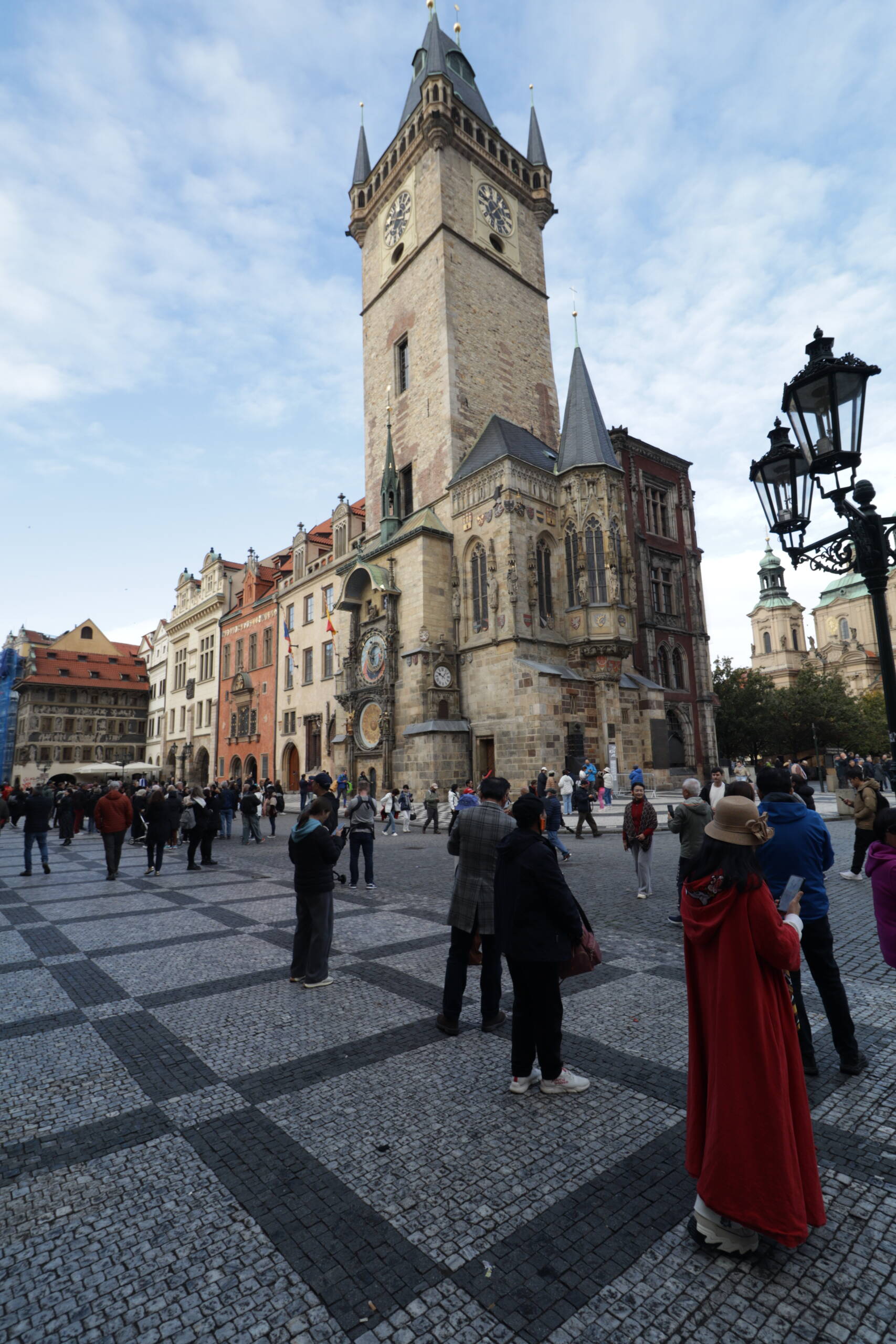
The frame above is Prague Old Town Hall from the square, shot ultra-wide from a low position. Tower, clock, crowd, paving, one lamp post. It works as a hero image for a reason that has nothing to do with the subject being famous.
The tower dictates the aspect ratio
A gothic tower is a vertical object. Turn the camera sideways to shoot it and you buy sky on both sides that carries no information. Turn the camera upright and every extra pixel of frame height is doing work: more tower at the top, more foreground at the bottom.
The practical constraint is that you need to fit the thing in. From this distance that means something in the 16-20mm range on full frame, or roughly 10-13mm on a crop body. Cheap ultra-wides are everywhere now and this is the job they are good at. You are not asking the lens for sharp corners or clean bokeh. You are asking it to swallow a tower.
Getting far enough back to use a normal lens sounds better and usually isn’t. Step back on a square like this and you fill the middle of the frame with other buildings, scaffolding, market stalls, and whatever else is between you and the subject.
Keep the converging verticals
Point a wide lens up and the tower leans back. Lightroom will straighten that for you in one click. Resist it, or at least look hard at the corrected version before you commit.
Two reasons. First, correcting keystone distortion on a shot this wide crops aggressively into the top of the frame, which is exactly where the subject is. Second, the lean is what tells the viewer they are standing at the base of something tall looking up. Straighten it and the tower reads as a flat elevation drawing.
There’s a middle setting. Correct maybe half of it, so the building stops looking like it’s falling over but keeps the sense of height. That’s where I usually end up.
The bottom third is not wasted space
The obvious instinct is to crop the crowd out. The paving pattern and the people are the reason the tower reads as large. Nobody knows how tall a tower is from a photo of a tower. They know when there’s a person standing near it.
The checkerboard paving here is doing double duty. It carries the eye from the bottom edge into the base of the building along diagonal lines, and it gives the lower half of the frame texture instead of empty grey. Squares, plazas and cathedral floors are full of this kind of geometry and it’s free.
Shoot from lower than eye level if you can. Crouching drops the horizon, exaggerates the paving lines, and pushes the tower higher up the frame.
Anchor one edge
The street lamp on the right isn’t in the frame by accident. Vertical compositions have a tendency to drift, especially when the top half is mostly sky. Something solid at one edge in the near foreground gives the frame a wall to lean on and adds a layer of depth in front of the subject.
Lamp posts, tree branches, an archway, the corner of a building. Anything that sits between you and the subject and doesn’t cover the important part.
Expose for the sky
Bright thin overcast is a nightmare for this kind of shot. Meter off the stone and the sky blows to white paper. The stone is a mid tone and it will come back. The sky won’t.
So expose for the highlights, accept a dark building on the back of the camera, and lift the shadows later. On the tower here that recovers the stone colour and the texture in the roof slate. If you clip the sky you also lose the cloud detail, and a plain white rectangle at the top of a vertical frame kills the whole image.
Check the crop before you leave
Your hero image is going to get cut. Sometimes to 4:5 for social, sometimes to 9:16 for a mobile full-bleed, occasionally back to 16:9 by a theme that ignores what you uploaded. Compose so that the essential elements survive all of those.
Quick test on the back of the camera. Imagine a square in the middle. Then a tall thin strip. Does the clock still appear? Is the top of the spire still there? If a 4:5 crop decapitates the tower, shoot again with more margin.
What I’d change about this frame: I’d have waited another minute for the man in the grey jacket to move, and I’d have taken one more step left to get the whole lamp bracket in rather than clipping it at the edge. Neither is fatal. Both would have taken ten seconds.