Shooting Inside Galleries: Mixed Light, No Flash, and the Visitor as the Subject
Most gallery photos fail for the same reason. The photographer points the camera at the art, gets a flat rectangle of someone else’s work, and goes home with a bad reproduction of a good painting. The room is the more interesting picture. Walls, spacing, wall text, and one person deciding where to stand.
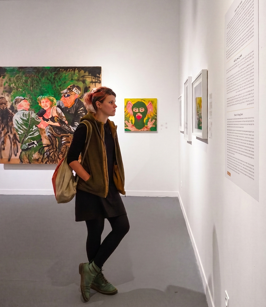
This frame works because the subject is turned away from the big canvas and reading the panel instead. That is the actual behaviour of a gallery. People spend forty seconds on the painting and two minutes on the label. Shoot the reading, not the looking.
The light is worse than it looks
Gallery lighting is built for the artwork, not for you. Narrow spots on the canvases, dim ambient fill everywhere else, and often a second colour temperature bleeding in from a skylight or a doorway. Your eye corrects for it instantly. The sensor does not. You get a green cast on the wall, a warm cast on skin, and a white wall that is neither.
Fixes, in the order I actually use them:
- Shoot raw. Auto white balance will pick one of the two light sources and be wrong about the other.
- Set a custom WB off the wall itself. Gallery walls are close enough to neutral to serve as a grey card.
- If the mix is stubborn, correct for skin and let the wall drift slightly. Nobody notices a wall that is half a degree cool. Everyone notices green faces.
- Sharpening comes last, after the colour is settled. Sharpening a colour cast just makes the cast crisper.
Flash is off, always. Not because of the guards, though the guards are a factor. Flash flattens the room and kills the only thing worth having, which is the falloff between the lit canvases and the dim floor.
Settings that survive the room
Wide aperture, high ISO, and accept it. f/2 at ISO 3200 is a normal gallery exposure and modern sensors handle it. Grain is not the failure mode here. Motion blur is. Visitors move slowly but they do move, and 1/30 will punish you on the one frame that mattered.
Meter for the face, not the average. The camera sees a lot of bright white wall and wants to underexpose. On this frame the wall on the right is a large bright block, and a straight evaluative reading would have dropped the subject a full stop into shadow.
Watch the floor. Grey polished concrete picks up spill from the ceiling lights and it will show every bit of noise reduction smearing you apply later. Go light on the noise reduction and let it stay slightly gritty.
Composition in a room designed to be empty
Galleries hand you negative space for free. The temptation is to fill it. Don’t. The white wall on the right of this frame is doing structural work, holding the eye and giving the figure somewhere to look. Crop it out and the picture collapses into a snapshot of a woman standing near some paintings.
Two other things that reliably help. Keep verticals straight, because a leaning wall reads as sloppy in a room this geometric. And leave the wall text legible-ish but not readable, so the viewer knows it is text without being pulled into reading it.
Then wait. Someone will stop, shift their weight, and stand still for three seconds. That is your frame.